Alison Henry's Art
Tuesday, June 21, 2011
Monday, March 14, 2011
"Paint It"

The idea behind this painting (acrylic and graphite) was, instead of just creating a normal painting of something, I would paint someone actually painting, which I thought was pretty clever. I saw this image on the internet and thought it was a cool concept, of painting on lipstick, so I tried to render it like the picture and although I didn't spend as much time on the detail, I think it turned out pretty well. It needs a lot of work but for now, It will do.
Wednesday, January 12, 2011

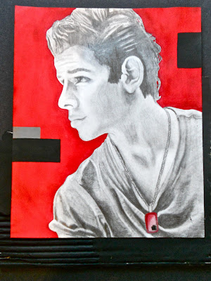
"Nick Jonas"
This is a simple portrait study of one of the most beautiful people on earth mixed in with the modern looking shapes and the solid red background. I still prefer charcoal over graphite because i never seem to get the full value scale out of pencils with makes my value look weak. The eyes were very hard to capture since i was drawing from a picture, i couldn't exactly find the light source so i just kind of guessed so i'm not sure if i like the eyes. However i think the fabric in his shirt turned out very realistic and it'd the part i'm proud of on this particular drawing. The cardboard at the bottom complimented the random rectangles and gave texture to the composition. Overall, a pretty easy drawing and i think it turned out well.

"Three Views of a Still Life"
This was a fun but difficult study because it really challenged me to draw exactly what i saw. The first piece, done in watercolor, was easier and i didn't spend that much time trying to make it look realistic, i tried to stick to simple contour lines drawings with little value in the watercolor. It is my favorite of the three. The next piece was done in graphite pencil and i don't like the outcome because, although i tried very hard, the value and shading wasn't done to the best of my abilities. But overall, i think it was average for a still life. The last piece was done in oil pastel, which was a medium i wasn't that familiar with at the time so i struggled with the shading on the gourd and the light source on the bottle so i didn't find this piece very successful but the beautiful colors almost covered those flaws.

"Nutella"
This piece was done entirely in acrylic and i plan to make some changes with the background since it is very plain and only serves in making the foreground pictures stand out. I'm not sure if i like this piece because of how the knife turned out with the nutella dripping off. To some people it looks very realistic but i can't see it that way after looking at it for so long. I love the bottle however. This painting was just a fun breadth piece to display my obsession for Nutella:)
Thursday, December 23, 2010
 "Dancing Color"
This piece was originally a gesture drawing study that was then created into anything i could make out of the sketches. I'm not very good at drawing figures so i hated this study at first but once i added the colors, it all came together very well. It was fun using all the different mediums like the watercolor and oil pastel and the bright colors all mixed together made the figures pop. It's a piece that makes you stop and stare and that to me sounds like a successful art work so i'm overall pleased with the turn out:)
Subscribe to:
Comments (Atom)
